Whether you are an entrepreneur, photographer, designer, marketer, or working in the field of online commerce, making proper web design choices is essential to your business. So what is new in the space for 2019? What are some current trends that keep your customer’s eyes glued to your products and services? There are quite few, with a trend moving towards more imagery, animations and graphics. The use of text is only used when required.
Below are a few of the best web designs and trends of 2021:
Proper Use of Black & White Palettes
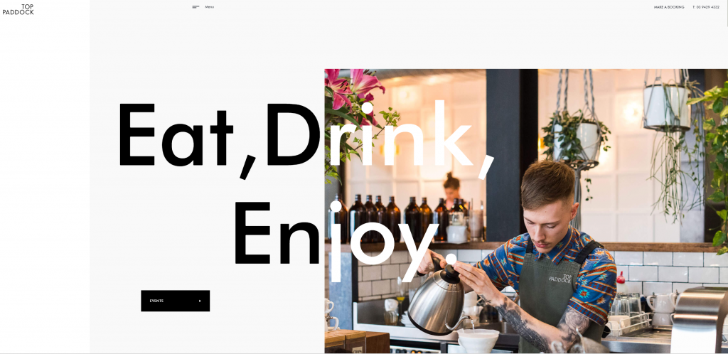
Black and white content is the rage these days. By utilizing black and white to highlight the site’s content, and then using color to draw attention to the website’s “call to Action” objects, gives the website beautiful contrast and tells the reader what they should be looking at. Try to use the black and white color palette to accentuate the shapes and textures of the web page but also to bring clarity to the design, making it look evident, strong, and assertive.
Natural Shapes
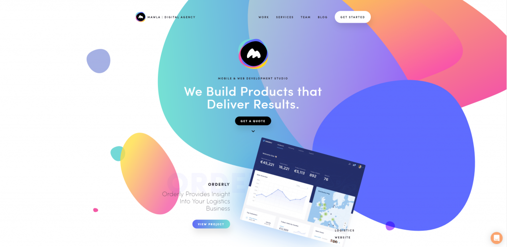
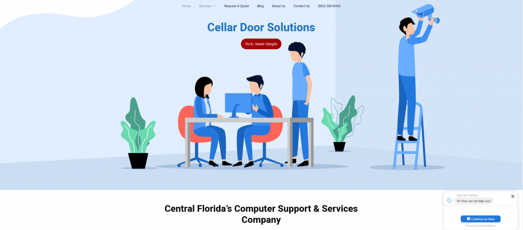
Using shapes is a great way to conceptualize the space on your website. Websites are inherently 2D, but by using shapes, the website can give the site a room-like and 3-D feeling. The shapes don’t have to be directly related to the content either but need to be clean an unobtrusive. Also, giving the shape a unique color and gradient give the them a texture which can make the content easier to follow.
Minimalism
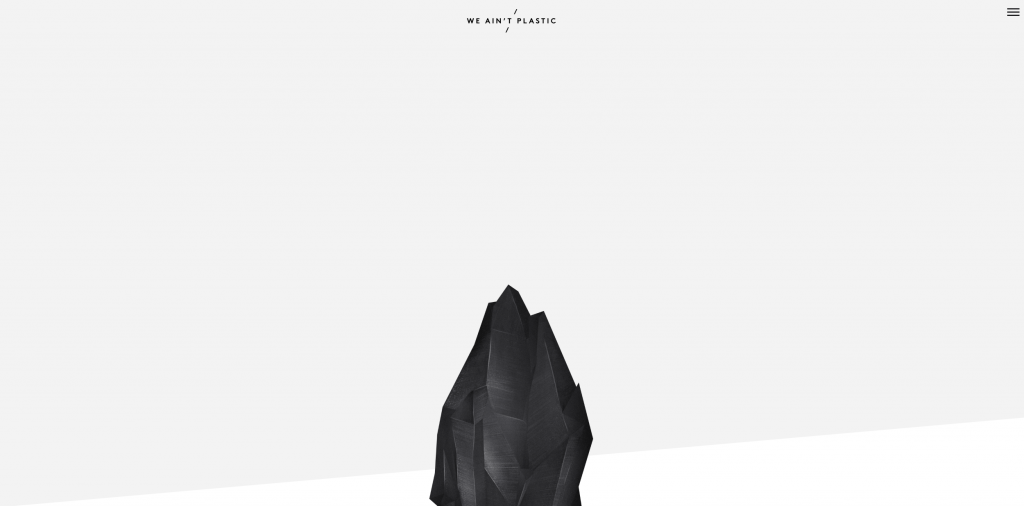
Minimalism has been one of the most significant movements in web design in the past few years. Google’s Material Design standard showcased the strength of a clean interface that only highlighted the important information without over-cluttering. The key to minimalism is to highlight the content without taking away from the site’s usability. Balancing between those has been difficult, with many sites doing too much in one or the other.
Glitch Art
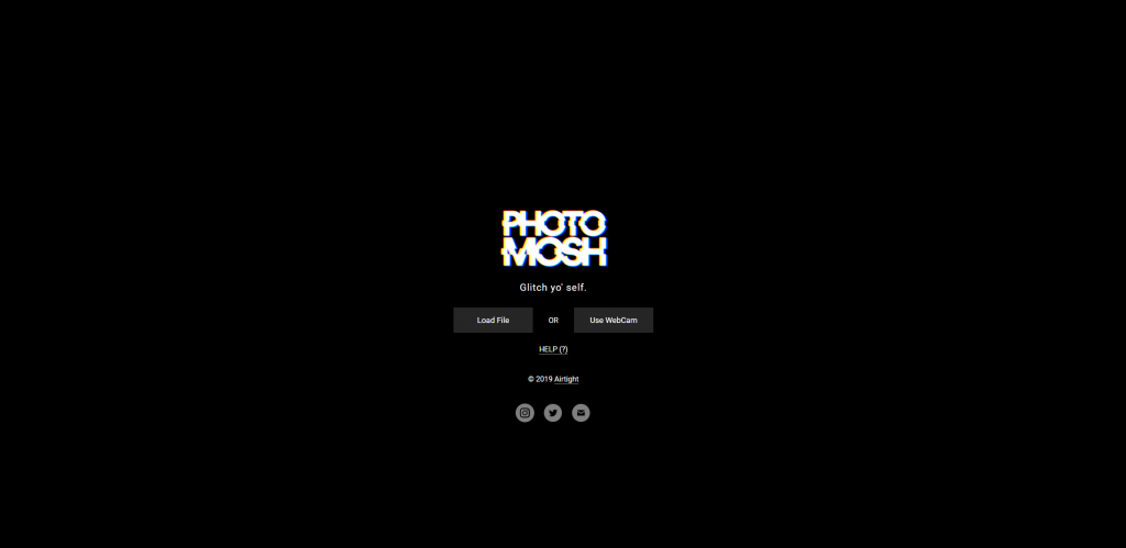
It is a form of art that takes one to the world of retro designs. Those who are not familiar with the outlook of the web page might find it bit messy, crinkled and distorted. Glitch Art is used in a lot of art-heavy websites that want to evoke a feeling rather than convey information. They tend to give the site a “retro” look. Try to think 80’s VHS or bitart.
Thumb-Friendly Navigation
65% of all web traffic comes from devices that are controlled by thumbs. Websites that make it easy to navigate and maximize screen real estate are the big winners in web design. That’s why single page websites have made a big comeback. It’s much easier to navigate a website if there is no navigation, only scrolling. If you find that the vast majority of your web traffic is coming from mobile users and your content is static and informational, your best bet is to look into organizing your content into a single page.
Serifs on Screen
Web Designers have been experimenting on ‘Serif’ fonts with the headers and callouts. Serif font decorates a web page and bring attention to the content and typography of a website. Be careful; they can be overused. But if your website is “art-heavy” then Serif fonts may be something to look worthwhile.
Animated SVG Art
Fast loading websites are making a big comeback these days, and so are Hero Images. These two conflict because of the large size required for the hero image and the long loading times needed to render them. But there is a way around this, certain filetypes can dramatically lower download and render times while keeping the crisp image clarity users love. SVG file images are often less than 100 KB for resolutions of 2160p, which is unheard of for regular photos.
Conclusion:
There you have it! 2019’s newest design tips and trends. With thousands of choices, users have to bring them content; having a clean and inspiring web design is vital to your brand and a website’s success. If you feel like managing all the different types of trends and design choices available, there are specialized companies that can help you. Cellar Door Solutions specializes in Website Design that is super clean, fast-loading sites and RANK in the search results.
